BrandBird may be easy to use, but it is also a powerhouse of features. This article is here to help you discover all our features and learn more about the BrandBird toolset!
AI (PRO)
Our AI features are there to help you elevate your designs with images and text that you can quickly generate within the platform.
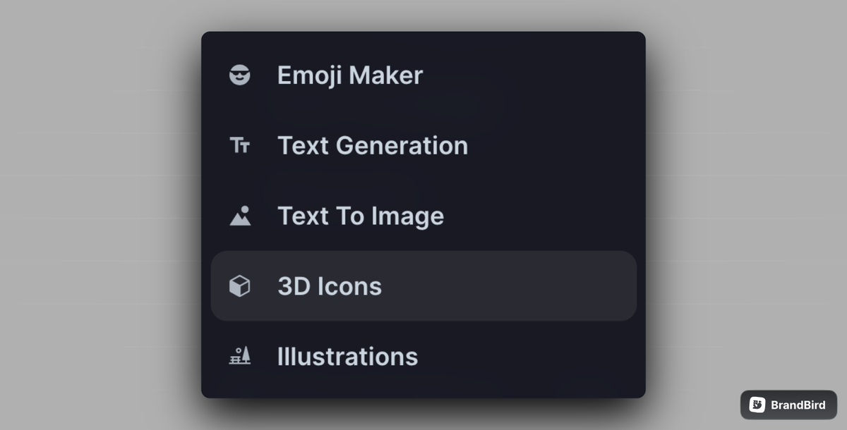
Navigating to our AI menu you will find 5 tools to choose from, so let’s see them one by one.
Emoji Maker: Give a short description and our Emoji Maker will generate a colourful emoji you can use as a sticker.
Text Generation: Our Text Generator can help you create content in no time. Just select the style you want your text to have, give it a topic and you are good to go.
Text to Image: With our Text to Image tool you can quickly create an image in 6 different styles, just by giving a short description.
3D Icons: Give a short description and our 3D Icons tool will generate a 3D icon you can use as a sticker.
Illustrations: Choose your preferred illustration style and colours, and give a short description to generate an illustration for your design.
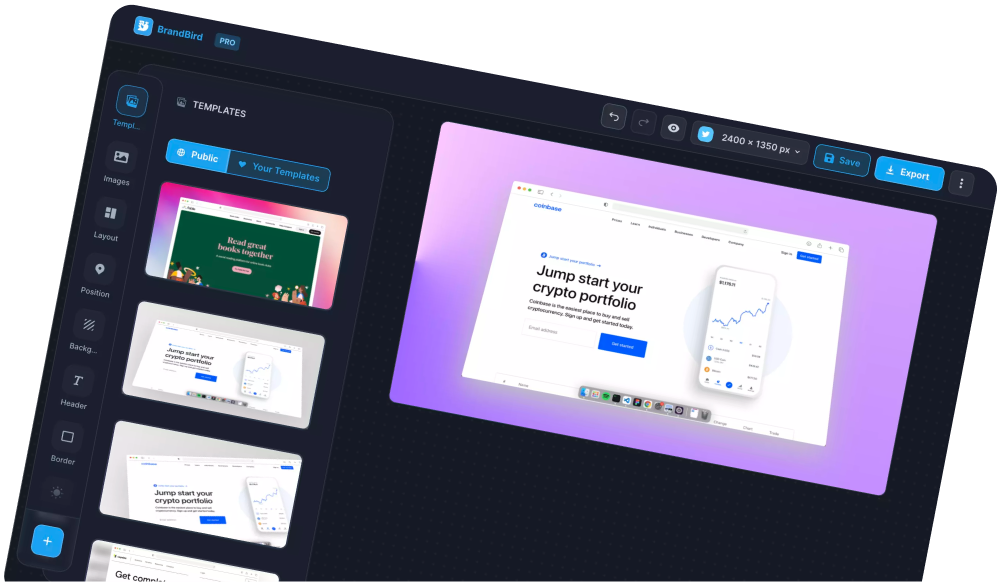
Templates (PRO)
Templates are a super helpful BrandBird tool and using them can significantly speed up your design process.
There are two ways you can leverage our templates feature:
- select one of our public templates, and customise it to your needs by adding your images and text
- create a design, save it as a private template, and reuse it every time you need a new graphic by simply changing the images and text
👉 Pro tip: Save templates with your brand’s colours and logo and reuse them to have quality branded graphics in just 5 seconds, without sacrificing your time or your content’s quality.
Images
Images are a core part of BrandBird and you will most probably find yourself using them a lot. Images can be added from you or generated with our AI features.
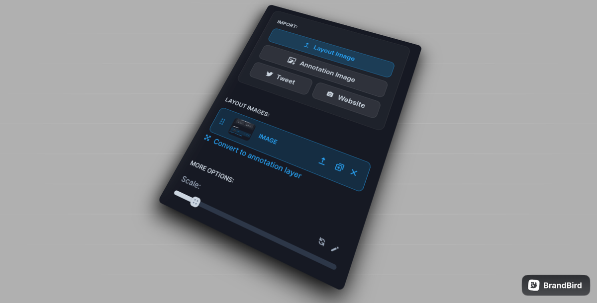
There are two types of images in BrandBird: Layout and Annotation images.
Layout: Our Layout images are designed to give you a more structured design, as you can only move them using the Position and Layout tools. When you upload two or more Layout images, we suggest using our Layout tool to place them in a predefined layout, for a more professional result.
Annotation (PRO): Our Annotation images are resizable, layer images that you can move anywhere in your canvas. They can be layered, along with the rest of the annotation items, so you can use them as images or as stickers, too.
Within our Images menu you will also find the options to add a Tweet or a Website as an image. By simply adding the tweet’s or website’s URL, BrandBird will add them as a Layout image to your canvas, and you can then adjust them to your needs using the image edit options.
👉 Pro tip: You can turn a Layout image to an Annotation one, and vice-versa.
Annotation
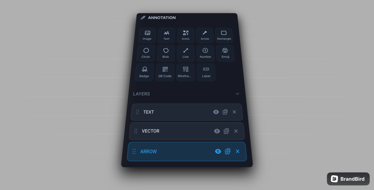
Annotations are resizable items, such as images, text, and shapes, that you can use to style your designs and make them unique. You can move them anywhere in your canvas and layer them too, by simply organising the Layer sequence to your preference. Now, let’s check them one by one.
Image: This is one of the two types of BrandBird images, which as we mentioned above, shares the characteristics and can be layered with the rest of the Annotation items.
Text: Our text annotations can be customised using different fonts and styles, colours and effects.
Icons: You can find a variety of icons, from 3D icons to scribbles, to make your designs even more visually appealing.
Arrow: Add a simple, or hand-drawn arrow to point out important parts in your designs.
Rectangle/Circle/Line: Add a shape such as a rectangle, circle or line, in your preferred colour and style.
Blob: Add a uniquely generated blob, customised based on your selections for shape and colour.
Number: An easy way to add a circled number to your designs.
Emoji: Find all emojis, to make your designs fun and fresh.
Badge: Add App store and Product Hunt badges for your ads and releases.
QR code: Add a URL and BrandBird will generate a QR that you can add to your design, and will link users to the website.
Wireframe: You can find a variety of cards and elements that you can use to create a custom wireframe to add to your design.
Label: Create a label or a button by customising the text and icon you want to show on it.
👉 Pro tip: Import .png images as annotation layers to use as custom stickers for your designs.
Background
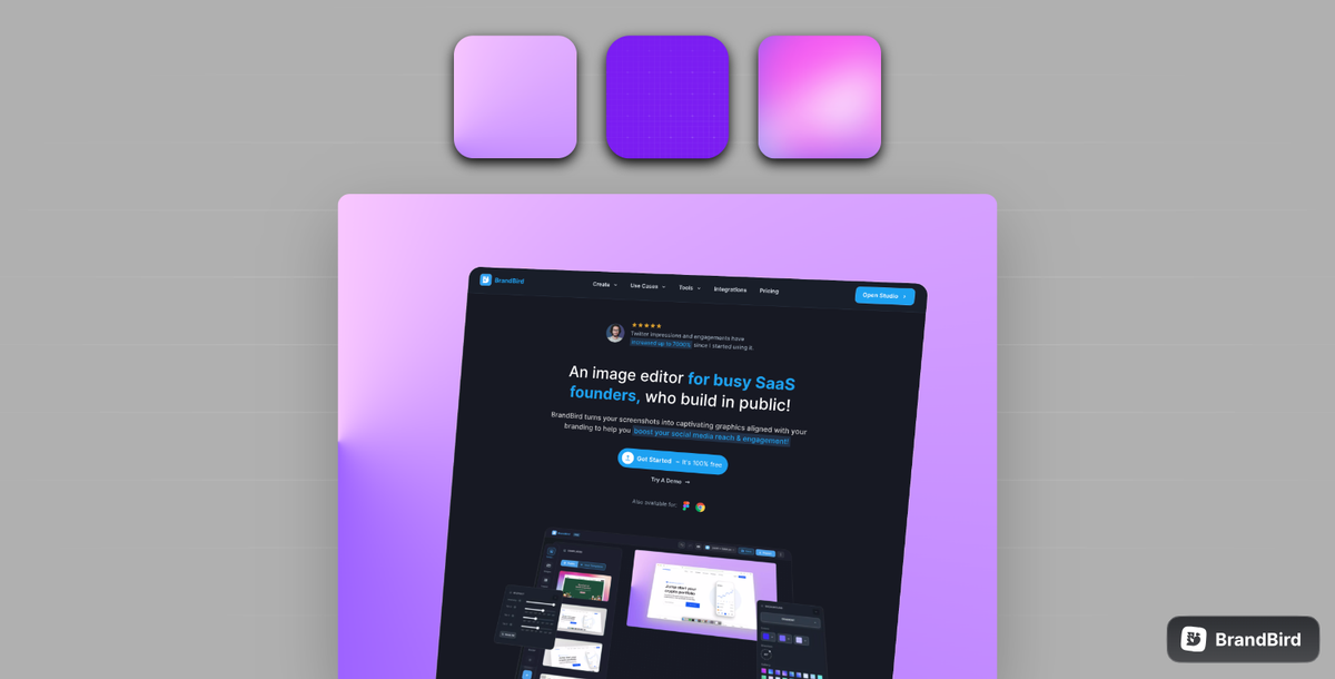
As background plays an important part in a design, BrandBird offers 5 different, customisable background options and a Random one, so your background is always on point. Now let’s see them one by one.
Solid: Simply select a colour to have as a solid background.
Gradient: Pick colours and a direction to create a unique gradient for your background, or simply select one from the gallery we’ve put together.
Mesh Gradient: Pick the back and front colours, and set the blur to generate a mesh gradient for your background.
Image: You can upload an image, search for one on Unsplash or pick one from our gallery, and set it as your background.
👉 Pro tip: You can blur the image or add a colour overlay to give your design more depth.
Pattern: Simply select a pattern and the colours, for a unique, two-toned background.
Random: Just click the Random button, and BrandBird will generate a background based on your image’s colours.
After choosing a background, you can also add a grid overlay to it, to make it even more unique. Simply open the Grid Overlay options and find one that suits your design best.
Mockup (PRO)
Device mockups can make your designs look 10x times more professional. To add a mockup, simply select the image you want to add it to, and then select a mockup from our pack.
Our pack has mockups for Macbook, iPhone, iMac, Safari, Emails and many more, so you can always find one to meet your needs 💻
Position
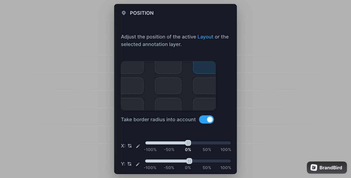
With our position menu you can adjust the position of a single image, a layout of images or an annotation item, in just two clicks. Simply select the image or item you want to move, and select it’s position on the canvas from the position menu.
3D
With our 3D effects you can shift an image’s perspective, make it look 3D and add depth to your design. To add a 3D effect, select an image, and then adjust the tilt options in our 3D menu.
Shadow
All images added to BrandBird have, by default, a small shadow added to them to make them pop. You can adjust or remove this shadow by going to the shadow menu.
There is a variety of shadow options and settings, so you can find one to make your image look its best! ✨
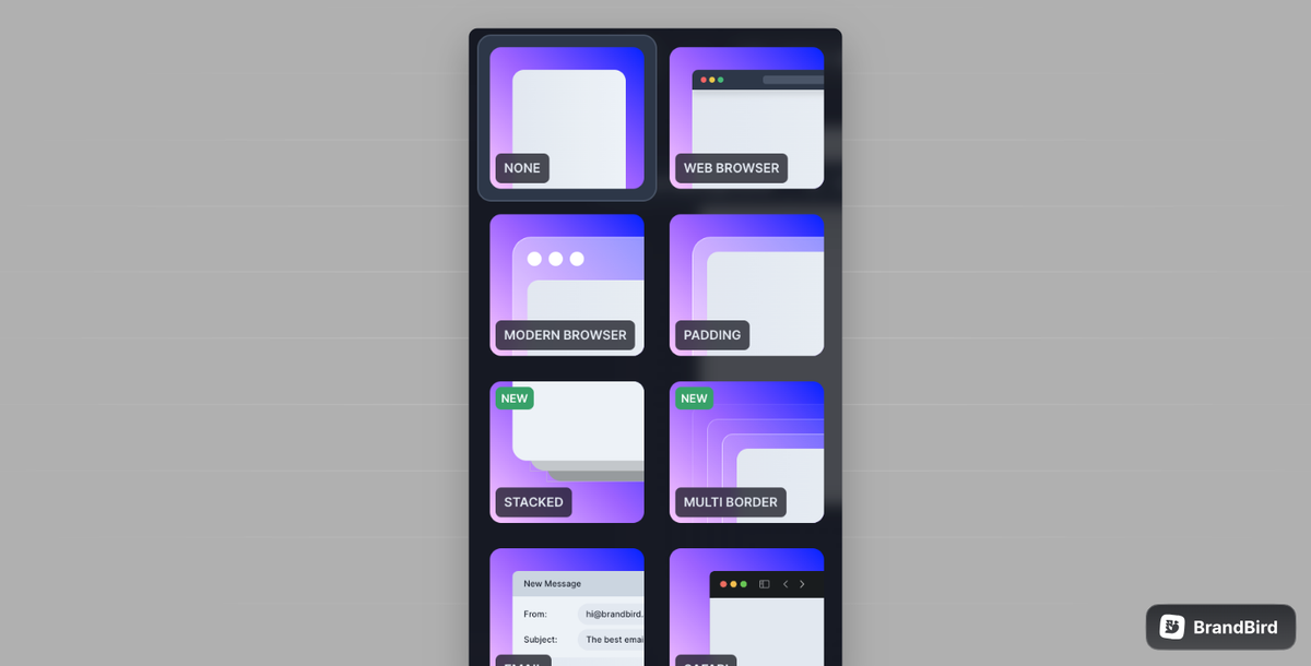
Border
Within our Border menu you will find options to add a border to an image or adjust its border radius.
Layout (PRO)
Our Layout menu is designed to give you an organised view of your layout images in one click.
When you upload two or more Layout images, just head to our Layout tool and select a preset to place them in a predefined layout, for a more professional result 👌
Header
With our header feature you can easily add text as a title to your layout images. Once you enable it, you will have the option to add a title, a sub-title, and a logo, and customise the view.
Please note that BrandBird will automatically adjust the width of your text to make it the same as your image’s, for a more aligned and professional result.
Watermark (PRO)
We understand that branding should be a core part of your designs, so with BrandBird you can easily add a watermark to your designs to brand them and make them recognisable to your public.
Plus, you can save your watermark, so you won’t need to upload it again each time you create a new graphic!
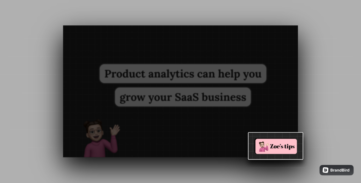
Brands (PRO)
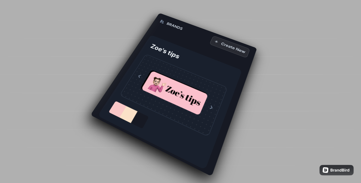
Our Brands feature can help you keep your designs branded easily and effectively. Within our Brands menu, you can set up your brand’s logo, colours, and even upload your brand’s font, characteristics that, once set up, will be available for you to use throughout the BrandBird app.
The Most Powerful Image Editor
for SaaS Founders
Get Started Now